Warren Isensee

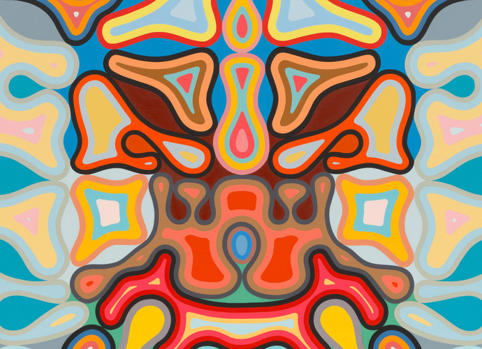
Warren Isensee’s “Interstellar Overdrive” (2019) is dominated by four large gear-like outlines.
Credit: Warren Isensee and Miles McEnery Gallery, New York, NY
Through Aug. 28. Miles McEnery Gallery, 525 West 22nd Street, Manhattan; (212) 445-0051, milesmcenery.com
Over the past two or three years,Warren Isensee’s abstract paintings, while always good, have taken a sharp turn for the better. For nearly a decade Mr. Isensee, who has been exhibiting since 1998, cultivated a distinctive geometry of parallel lines whose softened edges and pulsing color contrasts conjured the tubular glow of neon, compartmentalizing them into squares and rectangles with black outlines.
But recently a kind of dam seems to have burst. In paintings from the last year or so, viewable in person and online, Mr. Isensee’s lines of color curve, bulge and undulate, forming gorgeous often quatrefoil patterns that evoke gears, jacks and also intarsia Renaissance tables, their inlaid stone updated with a cartoonish bounce. Thicker rubbery versions of the black outlines push the colors in and out, squeezing them into narrow ribbons or allowing them to expand into quasi-shapes. The leftover spaces outside those lines are filled by weird shapes — nodules, lozenges, light bulbs and boomerangs outlined in two or three colors. Over all, there is a strange effect: The surface has such energy that it seems to make the canvas all but disappear.
Much of the above occurs in “Interstellar Overdrive,” dominated by four large gear-like outlines, and also in “LOL” and “Wild Kindness,” in which the gears morph into less regular shapes suggestive of butterflies or cartoon splats. In “As Promised,” a single black outline turns in on itself and becomes much more complicated, curving through the center and rippling along the edges, resulting in a symphony of polyp shapes.
Mr. Isensee sets out his compositions in small, delectable colored-pencil studies that are also on view. He then turns to canvas, painting freehand, in oil, producing a luscious surface. His palette tends toward calibrated variations on the primary colors: brighter and more pure outside the black outlines, paler within.
Figuring out the inter-workings of these paintings — their contrapuntal colors, geometric high jinks and bodily, mechanical or decorative suggestions — is tremendously thrilling for both mind and eye.
A formalist vocabulary continues to operate in these works. In particular Mr. Isensee seems to build, at least partly, but elaborately on the work of Paul Feeley, the uncategorizable abstract painter of the 1950s and ’60s. Feeley’s emblem-like shapes are almost quoted verbatim in “Out of Touch.” But these paintings go beyond formal. They are complex collaborations of line, shape and color in which everything coalesces into a kind of visual equality, to beautiful, and inspiring, effect. They also testify to how much time and work is required to become the artist that only you and no one else can be.
