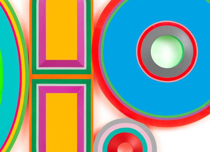
Beverly Fishman

Untitled (Abortion, Opioid Addiction, Panic Disorder, Birth Control), 2022,
Urethane paint on wood, 44 x 44 1/2 inches, 111.8 x 113 cm
Beverly Fishman confounds and mystifies. She has devoted her studio career to the human body, yet she has never done figural work; instead, she has created paintings and sculptures based on a lexicon of images and symbols derived from medical textbooks, drug culture, and the Physicians’ Desk Reference (PDR). Her subject—the body and illness as understood through the art and science of medicine—is enriched by her mastery as a painter. She has responded to the evolution of medical imaging and practice as a skilled colorist who works intuitively, is in command of her craft, and aligns her work with the language of modernist abstraction.
After exploring disease in the 1980s and 1990s, using medical imaging as her muse, Fishman has focused on cures. Since 1999, this has led to her prescient investigation of street drugs, medicines, placebos, and the insidious relationship between Big Pharma and health. Her work is a cipher pointing to issues of identity and contemporary culture. “It’s always political,” she says. “For years, I’ve dealt with the ways in which people’s bodies have been addressed by science as well as the medical and pharmaceutical industries.”
POLYPHARMACY
Fishman presents a new body of work in her exhibition Something for the Pain. Understanding that her practice engages the complexities of drug use and misuse, it would be a mistake to confine the meaning of the title to physical pain alone. In the past few years, we’ve experienced a global pandemic; seen the effects of climate change; and grappled with the ongoing issue of social, racial, and economic equity and justice. All of this has been against the backdrop of a devastating loss of life, relationships, and living habits. Many people have used pharmaceuticals to cope.
This suite of paintings is based on polypharmacy, the combination of drugs an individual might use or be prescribed to treat an illness. Like much of her work, the forms are derived from the shapes of the pills and medications listed in the PDR and presented in groups, alluding to a chemical cocktail or the drugs someone might elect to have in their pill box.
Some geometric shapes represent a portion of a pill, as if it was broken along its score line. Some have voided centers. All are coated with pristine color, often supersaturated or fluorescent. “I have to experience color as something physical,” the artist says. It covers all visible surfaces, including the shallow sides. Fishman’s wood substrate is crafted with precise shifts in plane, hard edges, and enticing color, mimicking the distinct imprint that distinguishes individual medications. Fishman’s wizardry is most apparent in the glowing edge of each painting. Super-saturated or fluorescent colors on the sides bounce onto the hanging wall, glowing as if there’s a hidden internal light source. Sometimes, when there is a void in the form, the reflection bathes the wall in a tint, creating the illusion of a painted surface when only reflected color fills the area.
UNKNOWN ALPHABET
To Fishman, the wall is a site that is conditioned and activated by form and color. “There’s the whole idea of balance,” she says. “And if you throw the balance off enough, the painting is in motion. It doesn’t rest. It isn’t easy. My color always needs to be off in some way, because I don’t want anyone to settle… I make pieces that have what I think of as a kind of imperfection.” Still, halcyon colors and simple geometric forms complicate how we “see” a painting. Imagine Beverly Fishman—artist, shaman, clairvoyant—creating a painting as a prescription for pain management. She understands that even the offer of a cure, or the promise of managing symptoms, helps put an individual on a pathway to healing, whether it’s alleviating the physical pain of a broken arm, the emotional pain of losing a loved one, or the psychological pain associated with historical trauma. As she mixes color and form in her crucible-cum-studio when she produces artwork, she is ever-present in the issues at hand. She knows that a painting won’t cure cultural and historical malaise. Something for the pain? This body of work offers space to reconsider assumptions, reexamine what is conventionally accepted as truth, and amend the conditions that trigger pain.
— Rebecca Hart
Publication translated into French by Felix Macherez.
