Patrick Wilson

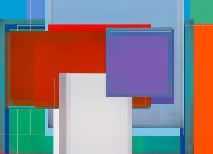
In the paintings of Los Angeles-based artist Patrick Wilson, layered squares of color attain unbelievable levels of transparency and rich density. Wilson uses humble tools: he applies acrylic paint with a drywall knife or house paint roller to geometric areas of canvas edged by masking tape. Yet, in both large-scale canvases and smaller works on panel, the works’ spatial constraints seem only to distill and enhance the pigment.
Writers often compare Wilson with the concrete abstraction of Piet Mondrian, or the color investigations of Josef Albers and Hans Hofmann, or the methodical approach of Frank Stella. However, we might consider Wilson’s formally controlled but vibrant compositions as a minimalist distillation of Wayne Thiebaud’s rainbow-hued outlines or Richard Diebenkorn’s big California color fields. The lines that divide the canvas do more than just distinguish one block of color from another—their own color is carefully balanced with the surrounding tones to enhance or minimize a sense of visual depth.
Wilson is also a sort of California flaneur: in Los Angeles, one absorbs visual information through a car window as much as by walking. While they may look like pure exercises in color theory and abstraction, Wilson’s works have titles—Hollywood, Lantern, Extra Spicy—that gesture toward real-world aesthetic experiences. Bailey Cove (2007), for example, is the name of a campground on Lake Shasta near the artist’s hometown of Redding, California; in Wilson’s abstract rendition of the area, he stacks overlapped squares of olive green, musty yellow, and slate gray near the bottom of the canvas, evoking a moment at dusk or dawn. By contrast, squares are flattened in Block Party (2013), maxing out the picture plane and yielding only slivers of a mid-afternoon sky blue surrounding large fields of hot-brick red and a summery white-gray.
Art consultant Allison Marvin, who has followed Wilson’s career for years, praises his commitment to using line, form, and color to draw in, rather than alienate, the viewer. “He creates these beautiful, luminous surfaces with a visual gravity that commands your attention but can’t be so quickly dismissed,” she says. “They can be bold—but they also invite you to walk up and immerse yourself in them, and not a lot of art can do both. That visual intimacy, extended over time, is important to Patrick; he’s always been disinterested in the rapid consumption of what’s au courant; he’s really just interested in the art of painting, his surroundings, and his process.” She mentioned the 2009 exhibition “Slow Food” at Curator’s Office, a 240-square foot space that brought viewers nose-to-nose with Wilson’s luscious surfaces.
When asked what artists came to mind when she thought of Patrick Wilson, Marvin mentioned several that the art genome did not link to Wilson’s work: David Mitchell, who translates out-of-body experiences into photographic abstractions that look strikingly similar to Wilson’s paintings; Johnnie Winona Ross, a painter who captures the attractive and intimate quality of Wilson’s compositions but also channels Agnes Martin and the landscape of the Southwest; and James Siena, whose highly detailed, vibrant paintings are derived from mathematical systems, varying from Wilson’s own mode of production yet sharing a similarly immersive quality.
Because of Wilson’s precise technique, his works may suggest a mechanical or digital mode of production and are often described in the language of the technological interface, filled with overlapping virtual windows, screens, and planes of opaque or transparent color. While the intense experience of looking at Wilson’s work may resonate with the strange intimacy we have with computer screens, the artist is less interested in visual metaphors for media interfaces, and more interested in the intersections of landscape, process, and time.
Ellen Yoshi Tani